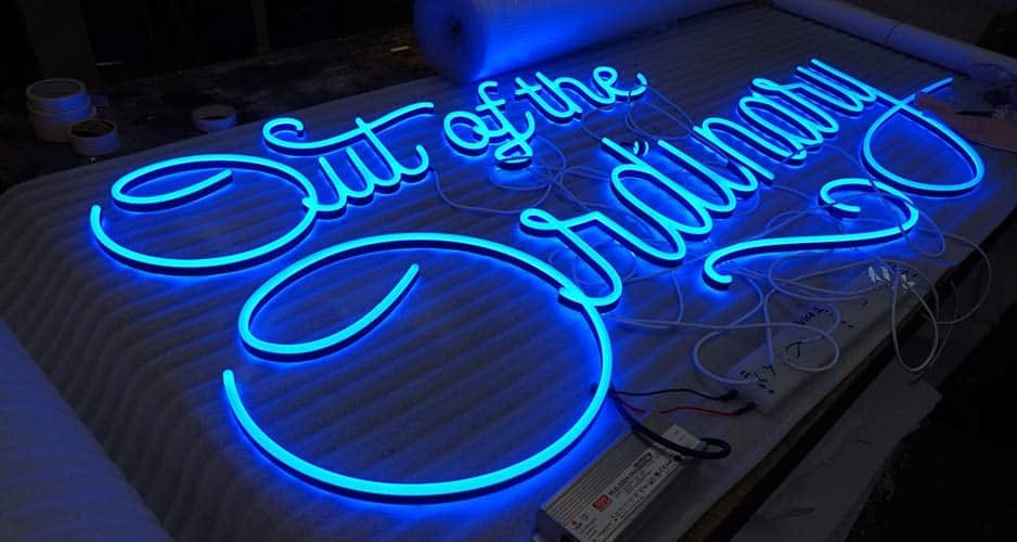
Neon signs are a powerful way for businesses to attract attention and make a lasting impression. Whether you’re looking to create a bold storefront display, highlight your brand inside your establishment, or add a touch of vintage charm, the right choice of letters can make all the difference. The shape, size, and style of the letters you choose for your neon sign can significantly impact its visibility, readability, and overall aesthetic appeal. This article explores which letters look best in neon for business signage, offering guidance on how to create signage that not only stands out but also aligns with your brand’s image.
The Impact of Letter Design on Neon Signage
The design of the letters in your neon sign plays a crucial role in how the sign is perceived. Different letter styles can evoke different emotions, convey various levels of professionalism, and even influence how easy your sign is to read from a distance. Here are some key factors to consider when choosing letter styles for neon signs.
Key Factors to Consider
Readability: The primary purpose of a neon sign is to be seen and read. Therefore, readability should be your top priority. Simple, clean letters are generally easier to read, especially from a distance or at an angle. Avoid overly intricate or decorative fonts that may look beautiful up close but become illegible when viewed from afar.
Brand Alignment: The letters you choose should align with your brand’s identity. For example, if your business is modern and sleek, opt for sans-serif fonts with straight lines and a minimalist design. If your brand has a vintage or classic feel, consider using serif fonts or script lettering that reflects that style.
Letter Spacing: Proper spacing between letters (kerning) is essential for neon signs. Letters that are too close together can become difficult to read, especially at night when the glow of the neon can blur the edges. On the other hand, letters that are too far apart can look disjointed and lose impact.
Size and Proportion: The size and proportion of the letters relative to the sign’s overall dimensions also matter. Larger letters are easier to read from a distance, but they should be balanced with the overall size of the sign to avoid looking cramped or overly sparse.
Statista reports that 75% of consumers are more likely to enter a store they have never visited before based on the signage, highlighting the importance of making the right design choices for your neon sign.
Best Letter Styles for Neon Signs
Different letter styles can dramatically change the look and feel of a neon sign. Some fonts and letter shapes are better suited to neon signs than others, depending on the desired aesthetic and purpose of the sign.
Popular Letter Styles for Neon Signs
Sans-Serif Fonts: Sans-serif fonts, such as Arial, Helvetica, and Futura, are among the most popular choices for neon signs. These fonts are characterized by their clean, straight lines and lack of decorative elements (serifs), making them highly readable and modern. Sans-serif fonts are versatile and work well for both indoor and outdoor signs.
Script Fonts: Script fonts, like Brush Script or Pacifico, offer a more decorative and elegant look. These fonts mimic the fluid strokes of handwriting, making them ideal for businesses that want to convey a sense of sophistication or nostalgia. However, script fonts should be used carefully, as they can be harder to read from a distance if the lettering is too intricate.
Serif Fonts: Serif fonts, such as Times New Roman or Garamond, have small decorative lines at the ends of each letter stroke. These fonts give a more traditional or formal appearance, which can be ideal for certain types of businesses, such as law firms, bookstores, or luxury brands. While serif fonts can look great in neon, they may require larger letter sizes to maintain readability.
Block Letters: Block letters are bold, thick, and easy to read, making them an excellent choice for neon signs, especially in high-traffic areas where visibility is key. Fonts like Impact or Bebas Neue are examples of block letters that can make a strong visual statement.
Comparison of Popular Letter Styles for Neon Signs
Letter Style
Description
Best For
Potential Drawbacks
Sans-Serif
Clean, straight lines, no decorative elements
Modern, minimalistic brands, high readability
May lack character or warmth
Script
Mimics handwriting, elegant, fluid
Nostalgic, sophisticated brands, decorative use
Can be difficult to read from a distance
Serif
Traditional, formal, with small decorative lines
Classic, luxury brands, traditional businesses
Requires larger size for readability
Block Letters
Bold, thick, highly visible
High-traffic areas, bold statements
Can appear too heavy or industrial for some brands
Sign Research Foundation found that well-designed signs, including those with legible fonts, can increase revenue by up to 7%, further emphasizing the importance of choosing the right letter style for your neon sign.
Balancing Aesthetics with Functionality
When designing a neon sign, it’s essential to balance aesthetics with functionality. While it’s tempting to opt for intricate designs or elaborate fonts to make your sign visually appealing, these elements can sometimes compromise readability, especially in low-light conditions or from a distance. It’s important to remember that the primary purpose of your sign is to communicate a message clearly and effectively. Therefore, simplicity often works best. A clean, straightforward design not only enhances readability but also ensures that your sign remains timeless and versatile, fitting seamlessly into various environments and branding updates.
Moreover, considering the sign’s environment is crucial. For instance, a neon sign designed for an indoor setting, such as a restaurant or boutique, can afford to be more decorative, whereas an outdoor sign, especially one facing busy streets, should prioritize boldness and clarity to catch the attention of passersby quickly. Balancing these elements will ensure that your sign is both beautiful and functional, effectively serving its purpose in any context.
The Importance of Testing and Feedback
Before finalizing your neon sign design, it’s wise to create prototypes or digital mock-ups to test different letter styles, colors, and layouts. Showing these prototypes to a small focus group, which could include employees, loyal customers, or even a professional designer, can provide valuable feedback. This step allows you to gauge how well the sign communicates your intended message and how it might be perceived by the general public. Sometimes, what looks good on paper or in a digital design tool may not translate as well in real life, especially when illuminated by neon lights.
In addition to gathering feedback, consider conducting real-world tests by placing a mock-up of the sign in its intended location. Observe how it looks at different times of day, from various distances, and under different lighting conditions. This hands-on approach can help identify potential issues with visibility, readability, or color contrast that may not have been apparent during the design phase. By investing time in testing and refinement, you can ensure that your neon sign not only looks great but also effectively captures the attention of your target audience and communicates your brand’s message clearly and powerfully.
Enhancing Your Signage with Custom Table Covers at Conventions
While the design of your neon sign is crucial, it’s also important to consider how you present your brand in other settings, such as conventions and trade shows. Custom table covers can complement your neon signage, providing a cohesive and professional look that reinforces your brand.
The Role of Custom Table Covers
Brand Consistency: A custom table cover featuring your logo and brand colors ensures that your booth is instantly recognizable, even in a crowded convention hall. This consistency helps reinforce your brand identity and makes your overall presentation more polished.
Enhanced Visibility: Just like a neon sign, a well-designed table cover can attract attention from across the room. It provides additional space to display your branding, message, or slogan, ensuring that your booth stands out.
Professionalism: A custom table cover adds a level of professionalism to your setup, making your booth look more inviting and organized. It shows that you’ve put thought into every aspect of your presentation, which can build trust with potential customers.
Cost-Effective Branding: Unlike large displays or neon signs, custom table covers are relatively inexpensive but provide a significant branding impact. They are also reusable, making them a cost-effective solution for multiple events.
EventMarketer reports that 60% of trade show attendees said that a booth’s overall design and appearance are the most important factors in determining whether they visit, highlighting the importance of a cohesive branding strategy that includes custom table covers.
Maximizing the Impact of Your Neon Sign
To ensure that your neon sign is as effective as possible, it’s important to consider not just the letter style but also the overall design, placement, and lighting.
Tips for Maximizing Neon Sign Impact
Placement: The location of your neon sign is critical. Ensure it is placed at eye level and in a position where it can be seen from multiple angles. For outdoor signs, consider the visibility from the street or sidewalk to attract foot traffic.
Lighting: The brightness and color of your neon sign can affect its visibility and impact. Choose colors that contrast well with the background and are bright enough to be seen both during the day and at night. Cool colors like blue and green are calming, while warm colors like red and yellow are more attention-grabbing.
Message Clarity: Keep the message of your neon sign clear and concise. Avoid overcrowding the sign with too much text or complicated imagery. The goal is for passersby to quickly understand what your business is about.
Maintenance: Regularly check your neon sign for any flickering, dimming, or other issues. A well-maintained sign not only looks better but also reflects positively on your brand.
Forbes highlights that businesses with well-designed and strategically placed signage can see an increase in sales of 10% or more, demonstrating the significant impact that effective signage can have on business success.
Conclusion
Choosing the right letters for your neon sign is a crucial step in creating signage that effectively promotes your business. Whether you opt for clean sans-serif fonts, elegant script letters, traditional serif styles, or bold block letters, each choice has its own set of advantages and considerations. By focusing on readability, brand alignment, and overall design, you can create a neon sign that not only attracts attention but also reinforces your brand identity. Additionally, enhancing your booth at conventions with custom table covers can further boost your brand’s visibility and professionalism. With the right strategies in place, your neon signage will serve as a powerful tool in driving traffic, increasing brand recognition, and ultimately, boosting your business’s success.
Introduction: Where Smart Investing Begins Let’s be honest—navigating the stock market can feel a lot like being thrown into a shark tank blindfolded, right? Whether you’re a first-time investor or a seasoned pro, having the right tools can mean the difference between cashing in big and losing your shirt. Enter 5starsstocks.com, a platform designed to…
👉👉Download Castle APK Now If you’re seeking an exceptional streaming experience for your Smart TV, Castle App is your ideal solution. Now compatible with Sony and Mi Smart TVs, this powerful application offers an extensive library of movies, TV shows, and web series, allowing you to stream your favorite content seamlessly across various devices, including…
Cats are universally adored creatures, often taking center stage in art, photography, and design. In recent years, high-definition wallpapers featuring cats have surged in popularity among pet lovers, artists, and tech enthusiasts. One particularly intriguing keyword is “wallpaper:hq2hr3icmae= cat“, which suggests a specific style or code associated with cat-themed wallpapers. This article explores everything related…
Imagine a world where the air is cleaner, the economy is stronger, and every household saves money – sounds like a dream, right? Well, this isn’t some far-off fantasy. Thanks to clean energy, it’s becoming a reality. In this blog post, we’ll explore how clean energy sources like wind, solar, and hydroelectric power are making…
Introduction of Technology Network In today’s fast-paced digital world, staying updated with the latest technology is crucial. That’s where Technology Network steps in. But what exactly makes this platform stand out in a sea of tech blogs? Let’s dive in and explore. What is a Technology Network? This, founded with a passion for all things…
Maintaining a competitive edge in the highly competitive business climate of today depends significantly on effectiveness and the minimization of cost. E-procurement technology helped procurement, an essential function in any company, to achieve incredible strides. Online marketplaces help make buying easier by increasing transparency, reducing the administrative burden and shortening time to purchase. However, because…